Yes you! Do you even have a brand??? Do you even know what a brand is? Are you scratching your head and wondering where you are going to but a brazier in your studio so that you can keep hot irons at the ready… well then this final episode of our summer series on selling your art is one you should be listening to!
The gals gave us a pretty straight forward chat about what branding is exactly, why we need to do it, and how to do it, and how this final piece of the puzzle ties into our earlier episodes in this series. There isn’t a lot to share here as far as links and what have you go but Katie did mention some logo examples.
Though not the only part of establishing your brand, your logo is the face of your brand and is what people will remember when seeing your work out in the world. Yes, you want them to remember your work, but you also want them to remember who did the work… and that is where your brand and memorable, simple, and awesome logos come in.
Just to show you the difference in the way that imagery, color, and even font choices work together to say something about your brand in a very short period of time, Katie wanted to show you her three logos.
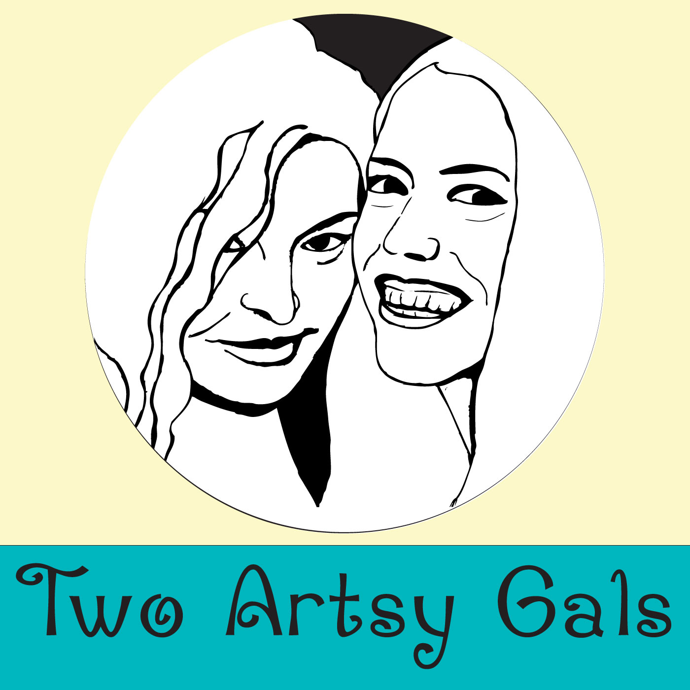
This is the Two Artsy Gals logo, which you can see being used in the banner for this blog. We also use it on our iTunes and Stitcher pages, on our Podomatic page, on our Facebook page, and anything else having to do with this show. We wanted this logo to tell people that this is a fun, upbeat, and creative show while still being professional. The colors used give it a fun and upbeat energy and the line drawing of Sharon and Katie’s faces give it a simple but creative/artistic element. The logo manages to be creative and artistic but remains clean and simple, which gives it the professional edge it needs to properly promote the podcast and the Two Artsy Gals brand.
![]()
This is Katie’s graphic design business logo. Again, because this is a creative endeavor, she wanted it to have a little flair to it but at the same time give a professional and put together feeling. It was also important to Katie that the logo shows a bit of her personality. To do all of this she chose to use her two favorite colors; they play well off each other, they are eye catching and give a nice pop to the logo, and the color combination is fun and a little bit wild. The fonts she chose to use are easy to read and distinctive. They are creative and further the creative and slightly wild or spontaneous air that Katie was going for but are still very professional.
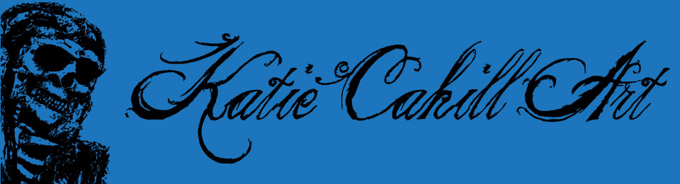
And finally we have Katie’s logo that she uses when selling and promoting her art. Because this is a logo with imagery that is probably a little to detailed and decorative/script/distressed font is used (notice, it can still be read though), she kept the colors VERY simple. Just two, blue and black… and when used on letterhead it can simply be black on white paper. If there had been more color used your head would just explode or something. No really, more color would have made the design completely overwhelming and people tend to ignore the visually overwhelming.
This logo needed to be a little looser and more artsy than the previous two examples so Katie used an image taken of a piece of her artwork and use Photoshop to make it look like it had been stamped. She selected a font that not only complement the image, but helped set the mood she was going for. Her logo had to say “Hey, my art, and the products I make are a bit dark and moody.” The blue and black along with the image and font combination do this job very well.
See… one designer/artist, three different logo designs for three different brands… all very different logos with very different messages… all very different faces to represent very different brands.
We hope that this episode ties together the series well and that it was helpful to all of you listeners who are struggling with, or just have questions about selling your art. If you would like to go back and listen to the previous episodes or hear them all back to back you can find links to each episode here on the shows blog, or you can go back and listen to them in iTunes or on Stitcher.
The series started with “Episode 10: So You Want to Sell Some Art” (June, 3rd 2014).
The second show in this series was “Episode 13: Shit You Need to Know About Copyright” (July, 2nd 2014).
Our third installment was “Episode 17: Shit You Need to Know About Photographing Your Art” (July, 30th 2014).
If you have questions or comments on this topic or any other show; you feel we missed something, you have ideas for the show or episode requests, or if you just want to tell us we are rad, you can send emails to twoartsygals@gmail.com. The gals will be back next week to talk with you about scissors and other sharp, stabby things so until then… Make some cool shit, yo!